
 Operations

With continuous advancements in technology, many types of app solutions have mushroomed in the global market. Among all of them, while mobile apps are highly popular, myriad consumers also prefer software that they can access through desktops. Statistically, 83% of mobile app users also admit that they prefer desktop-based solutions, if possible. The increased popularity of web app development in the market is therefore understandable.
However, it is vital to create the best web apps that could focus on making a responsive UI to assure better customer satisfaction. Abiding by the research studies, 73.1% of web design experts claim that non-responsive web design is the main reason for the loss of site traffic.
Hence, it becomes imperative to follow the right practices during mobile responsive web app development to make the design suitable, responsive and easily accessible for desktop and mobile-oriented screens.

Best practices for responsive web app development
Users try to shift using the app from a laptop to a phone. In the case of responsive web apps, it automatically transforms to accommodate the image size, resolution, and scripting type accurately to the other specifications.
Statistically, 21% of consumers in a survey stated they value videos, 39% focused on color, and 40% liked the images on a website. Therefore, during web app development, it is essential to focus on adding these elements and making them UI responsive. Now, here are some good practices to adopt.
- Choose the Right Framework
Designers should leverage the right type of framework that is suitable for creating flexible web designs. Some of them are available with built-in breakpoints and grids. Let’s find out about three of the prominent frameworks.
- Bootstrap: A popular CSS framework that remains the foremost choice of the developers for mobile-first and responsive website development
- Zurb Foundation: A responsive front-end mobile friendly framework that aims at fully responsive web app development
- Skeleton: A light CSS framework suitable for smaller projects, includes limited HTM elements
Moving over, here is a concise comparison of three widely used frameworks:
| Bootstrap | Zurb Foundation | Skeleton | |
| Best for | Drupal-based websites | Drupal 8 alpha websites | HTML-based sites |
Framework size |
Large | Medium-Small | Small |
| Included elements | Grid layout, components, font icons, etc. | Grid layout, components, font icons, etc. | HTML components, grid, boilerplate, etc. |
| USP of the framework | Works with JavaScript for tab-able content and slider inclusion. | Customized app solutions are easier to make since it has a smaller tech toolkit. | High-quality grid system |
- Reduced friction
Web designers can check out the most important elements to add to the responsive app design in the wake of making them mobile-responsive. One can prepare the tablet and desktop versions, following which CTAs, user flows, and micro iterations are worth focusing on to improve user objectives. Since mobile responsive development helps to concentrate on primary objectives properly, detecting and preventing friction also becomes simpler.
- Breakpoints
This system is useful when organizing the screen size options for UI into classes. The breakpoints trace the transformation of the screen sizes in the device when transitioning into another class.
For example, 1024epx works for laptops/desktops, 720epx for larger phones/tablets, and 320epx for standard phone sizes. You can reference the breakpoint system to keep as the template when preparing new web apps and make them responsive.
- Typography
In web apps, content typography is very important to facilitate seamless transition to readable font sizes when switching across between screen sizes.
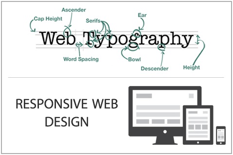
Focus on keeping the text font legible and clear, and adding suitable color contrast are among the most ardently followed practices for responsive web app development
- Layout patterns
In mobile-intuitive web app development, the experts should emphasize carefully on different layout options to increase app design and navigation quality. Some common examples of layouts to try our may include:
- Column drop
- Mostly fluid
- Off-canvas
- Layout shifter
- Tiny tweaks
Takeaway
Overall, it is possible to create web apps that are accessible, visually attractive, and user-friendly on different device types. An instant need is however to focus on using the right variations in the app interface components and UI design. Seeking professional help for the best quality results would be advisable in this context.
This is where the services of CRM-Masters will prove worthwhile for your purpose. We own an experienced team of expert developers who care to abide by all the requisite practices in order to make your web app highly responsive and functional. Feel free to get in touch with us and let us know your requirements. We will be prompt to act on your project with thriving results.